The visualization of data has become an indispensable tool for understanding complex information quickly and effectively. One of the most intriguing aspects of data visualization is the use of color. In this article, we will delve into the captivating world of Visualization of data by color, exploring its impact, methods, and best practices.
Introduction
Data visualization is the art of transforming raw data into understandable insights. In this digital era, the use of color has emerged as a powerful ally in conveying information with impact. Let’s explore the fascinating realm of visualizing data by color and how it can revolutionize the way we interpret complex datasets.
The Power of Visualization of Data By Color
Before we dive into the specifics of color, let’s appreciate the broader significance of data visualizations. They provide a clear and concise way to communicate patterns, trends, and outliers within datasets, making information more accessible and actionable.
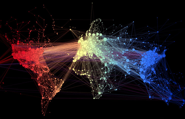
The Role of Color in Data Visualization
Color Psychology
Colors evoke emotions and convey meaning. Understanding color psychology is crucial when visualizing data, as different hues can influence how information is perceived. From calming blues to energetic reds, each color has a unique impact on the viewer.
Accessibility and Inclusivity
While color is a potent tool, it’s essential to consider accessibility. Designing with inclusivity in mind ensures that visualizations are comprehensible to all users, including those with color vision deficiencies.
Choosing the Right Color Palette
Consideration for Color-Blind Users
Adopting a color palette that accommodates color-blind users is vital for creating universally accessible visualizations. Certain color combinations enhance readability for everyone, regardless of their color perception.
Conveying Information Through Hues
Colors can represent different data categories. Carefully selecting hues for each category aids in conveying information efficiently, allowing users to grasp the significance of each data point effortlessly.
Types of Color Schemes in Data visualization
Monochromatic
Using variations in a single hue’s brightness and saturation is known as a monochromatic color scheme. This results in a presentation that is harmonious and visually unified.
Analogous
Colors that are next to one another on the color wheel are used in analogous color schemes. This results in a relaxing and peaceful visual experience.
Complementary
On the color wheel, complementary hues are situated opposite one another. Because of its great contrast, this scheme is appropriate for emphasizing particular data points.
Tools for Effective Visualization of data by color
Data Visualization Software
Specialized software facilitates the creation of visually appealing charts and graphs. These tools often include features to customize color palettes for optimal data representation.
Online Color Palette Generators
For those without design software, online color palette generators provide an easy way to experiment with different color combinations and find the perfect palette for their data.
The Pitfalls of Poor Color Choices
Misleading Interpretations
Ineffective color choices can mislead viewers, leading to incorrect interpretations of data. It is crucial to choose colors that align with the intended message to prevent confusion.
User Experience Challenges
Poor color decisions can result in a suboptimal user experience, causing frustration and hindering the effectiveness of the visualization.
Real-World Examples for Visualization of data by color
Infographics
Infographics leverage color to make information visually appealing and digestible. A well-designed infographic captures attention and enhances data retention.
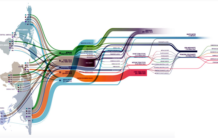
Charts and Graphs
From business reports to scientific research, color in charts and graphs aids in quickly identifying trends and outliers, simplifying the communication of complex data.
Trends in Visualization of data by color
Dark Mode
Dark mode is gaining popularity in data visualization, reducing eye strain and providing a sleek, modern aesthetic. Implementing dark mode requires thoughtful color choices to maintain clarity.
Vibrant vs. Subdued Tones
The choice between vibrant and subdued color tones depends on the audience and the message. Vibrant colors may capture attention, while subdued tones offer a more sophisticated and calming presentation.
The Future of Visualization of data by color
Innovations in Color Representation
Advancements in color representation technologies, such as high dynamic range (HDR) displays, open new possibilities for creating more vibrant and lifelike visualizations.
Integrating Virtual Reality
Virtual reality presents an exciting frontier for data visualization. Immersive experiences can enhance understanding by incorporating depth, dimension, and dynamic color elements.
Best Practices for Beginners
Start Simple
For beginners, simplicity is key. Starting with a basic color palette and gradually experimenting with more complex schemes allows for a smoother learning curve.
Test for Accessibility
Always test visualizations for accessibility. Ensuring that color choices are inclusive enhances the reach and impact of data representations.
Challenges and Solutions in Visualization of data by color
Overcoming Color Overload
Avoiding color overload is crucial. Balancing vibrancy and subtlety prevents overwhelming the viewer and allows for a more focused interpretation.
Adapting to Different Cultural Perceptions
Colors can have varied cultural meanings. When creating visualizations for a global audience, understanding and respecting diverse cultural perceptions of color is essential.
Final Thoughts
The visualization of data by color is a dynamic and ever-evolving field. The judicious use of color enhances the interpretability of complex data, providing valuable insights and facilitating informed decision-making. As technology advances, we can expect further innovations, pushing the boundaries of what is possible in the world of data visualization.
FAQs
Why is Visualization of data by color in important ?
Color enhances the visual appeal and interpretability of data, making patterns and trends more accessible.
How can I choose the right color palette for my data?
Consider the nature of your data, user demographics, and accessibility. Test different palettes to find the most effective one.
Are there tools available for creating color palettes?
Yes, various online tools and data visualization software offer features for designing custom color palettes.
What are the common pitfalls of using color in data visualization?
Misleading interpretations and poor user experience are common pitfalls. It’s crucial to choose colors thoughtfully.
How can beginners approach data visualization with color?
Start simple, gradually experiment with different color schemes, and always test for accessibility to ensure inclusivity.